User Assistence
Many sites don't really require instructions. But as companies move more of their business out to the Web, we often expect the customer to do more "self-servicing".
Here are some things to think about when you need to explain how it works in a User Guide document or an Online Help Module or embedded User Assistance.
Be Helpful
Types of Assistence
Since nobody really reads documentation, the interactive User Assistance toolset needs to be concise, proactive and very goal-oriented.
It is often used to learn about the software (Instructional Mode), to refresh one's memory about the software (Reference Mode), to encourage use of the software (Motivational Mode) and as a handy reminder (QwikReference Materials).

Instructional Mode
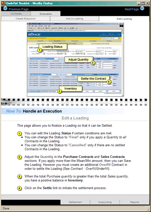
This is a Qwik-Reference popup that provides contextual background to understand the task at hand.
It describes what functions the software supports
It describes how to use the software
It provides examples to reinforce learning
It may also provide "step-by-step" procedural instructions for how to accomplish a task.
This handy "how-to" electronic desktop reference (It was also printed) was distributed to every user when the newest software was installed.
View the case study in my portfolio: Bunge Global Markets

Reference Mode
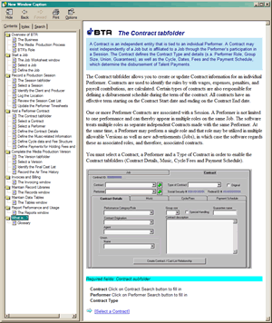
This conventional "online help" package organizes the information for swift and efficient search access, but requires that you be very self-directed. It will help you - if you help yourself.
The reference materials are often packaged as a Table of Contents or keyword-searchable Index.
The most popular goal-oriented reference is, of course, FAQ's, which capture the most "frequently asked questions" as quick, direct, task-specific answers.
View the case study in my portfolio: BTR

Motivational Mode
Often the Project Rollout requires a high-level user assistance piece that is motivational as well as informational.
This printed marketing brochure was designed to lay the groundwork for acceptance - both by end-user brokers and by their local managers.
View the case study in my portfolio: Bunge Global Markets
Basics
Here are some of the things that you may want to present right up front when designing User Assistance:
Environment
Target Audience
Purpose & Critical Tasks
How to Use
Describe aspects and usage examples
Presentational conventions (show examples of symbols, styles and syntax)
Reference/Support and Related documents
Implementation Checklist
It's nice to have a conceptual map of how the software is organized. The user experiences the software as a series of screen displays, so provide graphical examples that they can relate to.
Describe and illustrate all visible interface and design conventions within the software:
Operational Flow
Menu structure
Toolbars
Icons and symbols
Use and interrelationship of windows (s.a. popups)
Keyboard conventions (shortcuts, dedicated keys)
Procedures
Scope & Purpose of the Task (what it does & doesn't do)
Materials necessary to complete the task (s.a. passwords, access
authorization, data)
Warnings and Conditions (what happens, consequences, results)
You may also want to address some of these issues:
Input (data necessary to accomplish the task)
Output (Results, changes to screen display, effect on files or data))
Invocation (how to start a task, required/optional parameters, default options, order and syntax)
Suspension (how to interrupt and restart a function during execution)
Termination (what happens if the task is interrupted)
Error States / Troubleshooting
Error Messages / Recovery
Support Info
....and don't forget
Terminology / Glossary
FAQ’s