SiteMap
Some of the types of sitemaps we see often:
These days the Sitemap is used mostly to provide a quick, comprehensive overview "snapshot" image of a site.
These high-level sitemaps allow project stakeholders to sign-off quickly on the direction of their projects.
High-Level Overview
Olde Schoole Structure
I've always wondered what a "sitemap" really is...
Historically, it was a literal/technical overview of the categories of a hierarchically-organized site (i.e. "the bucket list"). Sort of a SuperMenu. Very logical, if you buy into the structure, but not necessarily flexible.
Because the logical/hierarchical sitemap doesn't necessarily reflect how you actually experience the site. These "views" tend to be very functionally based on roles, workflows, mental models.
And it really can't capture the referential elegance of a robustly-hyperlinked environment that easily transcends the organizational boundaries - Those "lateral connections" that allow us to make just-in-time leaps to appropriate info.
Mobile "flat" design is less dependent on hierarchical categories. Your interaction is determined more by targeted workflow and invasively "helpful" background applications that serve up solutions proactively. More digital self-awareness means less conscious choice.
Overview
The sitemap is a graphical image which indicates the high-level structural organization of the legacy system. Textual callouts often provide context:
- Number of subsections beneath
- High-level observations about content and usage
- Assessment of good & bad, weak & strong points
Client stakeholders should have a high-level handle on the shaping of the legacy site, the scoping of tasks that lie ahead.
"Everything is deeply intertwingled. In an important sense there are no "subjects" at all; there is only all knowledge, since the cross-connections among the myriad topics of this world simply cannot be divided up neatly. Hierarchical and sequential structures, especially popular since Gutenberg, are usually forced and artificial...people keep pretending they can make things hierarchical, categorizable and sequential when they can't."
Ted Nelson - "Computer Lib / Dream Machines"
Sitemaps give us a picture of how we organize our thoughts
Corporate / Intranet : "Self Service"

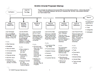
This proposed sitemap structure allows employees easy access to a range of corporate / intranet functions.
It reflects the navigational structure of the Intranet Demosite document.
View the case study in my portfolio:
SCANA
Brochureware : "Presentational Mini-Site"

The Mini-Site is often basically a brochure: Several pages that present a topic of interest.
The ABN AMRO site was just that, with direct connections to PDF collateral shown at the bottom of the sitemap.
View the case study in my portfolio:
ABN AMRO
Application-oriented : "Workflow"


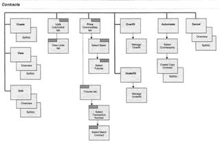
Here's the sitemap of the "Contracts" management tools interface we developed for Bunge Global Trading. It focuses on:
Create a Trade Execution
Select an Execution or Loading
Edit attributes
Add a Purchase or Sales Contract
The workflow captures how the pages in the sitemap fit together to accomplish the mission-critical trading tasks.
View the case study in my portfolio:
Bunge Global Markets
Information Retieval - "the Library"

The West Point Library website was structured for directed self service by a limited group of participants with very defined needs: Student Cadets, Faculty, Administrators and - to a lesser extent - Visitors.
View the case study in my portfolio:
USMA West Point