Response Ability
It's Hip. It's Sensible. It's Obvious. It's Necessary. It's Happening.
Responsiveness in Design happens on several levels:
Context
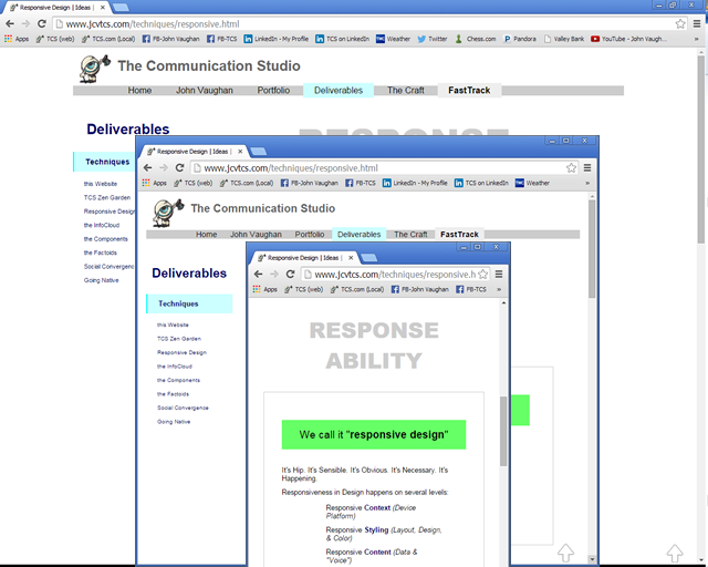
Resize the browser - The screen presentation changes dynamically.
You can also "force" the site to resize itself by selecting Desktop, Tablet, or Mobile layout from these controls:
Give it a try from the Responsive control panel.
Or, you can resize the browser itself, and the website content will reconfigure itself dynamically.

This is what most people mean when they talk about Responsive Design: That the page will resize itself to multiple device platforms.
But there's more to it than that.
Styling
The TCS Zen Garden page allows you to self-service a little in terms of Layout, Graphics & Color Styling .
Check it out.
You can even influence Content.
Content
My tendency is to embellish the information I provide with historical citations, explanation, anecdotes, comments, factoids, quotes - These are all part of the Context which provides meaning to the Content. But all of that data can be overwhelming.
I've engineered content attributes into my stylings. Some of the style themes present more - or less - data. As well as different types of data.
It's not only data information. It's "voice". Some styles are chattier and more casual. Others are more technical.
Behavior
Responsive Design is very "mobile-centric". Tablet & phone devices use a gestural interface. Our UI's are now going "beyond the Mouse".
But it's not just the technology-driven metaphor. We're also considering different ways of looking at and dealing with information. Ubiquitous Social Networking and Big Data have resulted in a whole new set of tools and behaviors.
The Big Challenge
The recent changes to my website are more of a "retrofit" than a "makeover": There's not much new structure or content. Instead, the existing content is made more flexible.
That's actually harder than building something new from the ground up.
It's also closer to the sort of UX challenges that most of my clients face.