Transition
Portfolio Showcase : 1990 - 1999

After consumer videotex came and went in the late 80's, "The Internet" existed in a rudimentary form, but hadn't yet evolved into the highly sophisticated Web that we know today.
Aside from shallow "brochure-ware" sites, most businesses weren't really ready to do highly transactional consumer-oriented business on public networks just yet. A few intrepid corporate adventurers were beginning to experiment with inward-facing intranets. B2B "applications" began to migrate from closed networks and CD-ROM.
Consistency
Callbacks for Repeat Business
Deliverables
% engagements involving all these:
- Content Inventory
- Heuristic Evaluation
- Best Practices
- Wireframes
- Demosite
- CSS Styleguide
- Info Architecture
Average # Documents per Client
Quality
Fortune 500 Client Engagements
Then along came
Visual Basic, Hypercard, Lotus Notes and ... the Web. These platforms gave the business world tools to easily customize their own in-house software products and services with a nice user interface. Toward that end I focused on my Design and Architecture skills.
As a UI Guy, I needed to be able to work with all of these new tools. I spent most of the first half of the decade learning to do just that.
Meanwhile, the focus of the IT department evolved from mainframe to desktop.
Communicating the Design
During this period I also honed my Process and Documentation skills. The IT environment really demanded a greater professionalism in this "meat and potatoes" aspect of the development process.
As software got smarter and more complex, we needed to be able to define Interaction Design in terms of behavior - not just graphics.
The New Kid on the Block
Around 1995 the term "Information Architect" first appeared as an actual mainstream job description. Corporate IT departments were beginning to understand that this was a valuable new skillset that needed to be integrated into the development process.
These early years of the usability field were a tremendous professional challenge and a great time to be a usability evangelist for The Vision Thing.
1990-1999
 Postalworks
The software developer had put together a nice set of software features and tools that would manage an email direct marketing campaign. In late 1999 they contracted us to pull it all together into an interactive, easy-to-use, saleable package.
 Broadcast Traffic & Residuals
The commercial talent payment service bureau wanted to migrate their legacy mainframe-based system to a more "user friendly" windows and web-oriented interface.
 AT&T Interactive Voice Response
Provided usability assessment and interaction design for ATT's Interactive Voice Response (IVR) service at their Customer Call centers.
 N2K / CD-Now
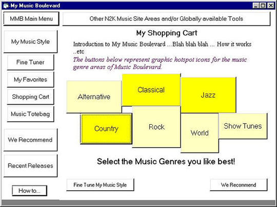
Music seller CD Now wanted to create its own "Amazon-like" music and entertainment shopping cart experience, My Music Boulevard.
 Sumitomo Bank
The transactions processing development group at Sumitomo Bank wanted to document their back-end Unix processes for backing up financial data at the end of day.
 NBC Research
NBC had developed a tool so that their market research teams could examine, compare and manipulate dynamically-changing Neilsen-based TV viewership data. But usability was an issue.
 Dow Jones Markets
On-Staff as the Documentation Manager at Dow Jones Markets (formerly known as Telerate), I supervised the documentation, interface design and usability practice for the e-commerce Transactions Development Group
 Instinet (Reuters)
On-Staff from 1994 to 1997 as the as Information Architect and Interface Designer for Instinet's Front End Design Team, which provided a central pool of design resources to software development groups throughout Instinet.
 Newspaper Association of America
The Electronic Sales Assistant (ESA) gave local newspapers a complete suite of Powerpoint-like, updateable, accessible, sales presentation tools.