Health & Safety
Lead-Free Kids / Merkley
Merkley +Partners (also our agency client in 2008) asked us to guide their redesign this public-facing self-service health site, a partnership between the EPA and the Ad Council. We simplified the UI, spoke to the target audience (Moms), gave it a social networking edge, and focused on immediate “calls to action”.The Value Proposition
- Provide targeted UX services at the level requested by the client (quickly-rendered "skeletal" wireframes)
- Collaborate closely with agency team to identify audience, CTA's, workflow
- Recommend and model value-added features & insights
Challenges
The legacy leadfreekids site was meant to offer health and safety-oriented self-service. But it was an uninspiring hodgepodge that failed to reach - or motivate - its target audience.

- Reorganize collateral with an eye towards practical usage
- Focus on the Target Audience - and their needs
- Invigorate the experience with one-click Calls to Action
- Create a Living Community of Interest
- Integrate Professional Solutions Partners into the mix
- Reach across cultural, linguistic and accessibility barriers
Solutions

Merkley didn't ask us to brand the site - They already have excellent folks in-house to do that.
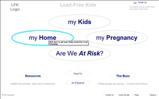
We provided information architecture and content strategy in a clickable demosite that provided a structural framework (See first image).
They restructured the site on the basis of our "raw" wireframes guidelines and "skinned" it attractively (See second image).
Value-Added:
- compliance with international Accessibility Standards
- implement Social Networking
- feature immediate Calls to Action
Satisfaction
Mathilde Benington, GM, Media/Interactive at Merkley + Partners (07/12/2011):
"Happy birthday! Check out leadfreekids.org to see your handiwork. Section 508 compliance notwithstanding, it's really all you. Spanish translation still in progress, but if you click that link you can see the improvement. Cheers!"