the Customer
The best way to serve your customer is to design a site that's intuitively obvious, appropriate in its complexity, and easy on the eye.

Nobody ever reads the manual
It's boring. Wordy. Too theoretical.
Nobody wants to learn how something works
We want it to be obvious.
Immediacy rules
Relevance and appropriateness are a big part of that.
Aside from good basic design, there are several simple things we can do to make the "customer experience" better at the level of screen design.
All men by nature desire to know.
Context sensitive info. Available at the moment of need. Lean text. Task-oriented demos. And Pictures.
Documentation Checklist
Context-Sensitive
This "just in time" info is the main source of useful help. These are small information boxes that popup when the mouse hovers over something.
In-Page Directions
Call it an Introduction, a Summary, an Overview, whatever: Well-written (concise and clear) on-screen text tells me Where I am, What I can do, and How I can get there.
Tutorial
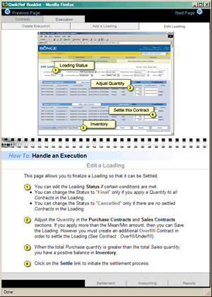
This is a Qwik-Reference popup that provides step-by-step guidance through the task at hand.
Mini-Presentation
Don't just talk about it - "Show Me". Target the 3-to-5 most important tasks and demonstrate them on-screen. The extra effort will be well-rewarded.
FAQ's
Frequently Asked Questions show that you understand the situation ("I anticipate your question. Here's the answer.") If you find you've got a bunch of FAQ's focusing on a particular topic, then you may want to create a mini-presentation.
Site Map
A visual overview of the site representation speeds understanding and can be an excellent shortcut for those who use it. As ever, a picture is worth a thousand words.
Standard Online Help
Includes the usual power tools: Table of Contents, Index and Keyword Search. This stuff is packed with information - The challenge is getting people to use it. Screenshots and graphics help a lot.
Hyperlinks are great for making immediate connections, but I often don't know what I'm getting into. Sometimes the biggest interactive design challenge is to provide a hint of what happens next...