Photography Studio
Rick Daccardi Photos
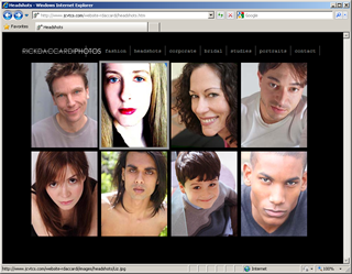
This was Rick's first website. He wanted it simple and he wanted to present the range of his photographic skills and visual sensibility.
The Value Proposition
Challenges
In this first foray into electronic media, Rick wanted to:


- establish a presence on the Web
- forge his identity as a professional
- showcase his skills
Clearly, there are already many, many established, talented photographers on the Web.
How could we make his site memorable?
Solutions
- We kept it simple - Just a few areas with a few pictures.
- We focused on the areas that were likeliest moneymakers as services:
- We made sure that all of the pages were "small" - easy to load and easy to view. Rick wanted potential visitors and potential clients to be able to quickly scan the breadth of his work. But If you want to view a Fashion shot more closely, just click on it for an enlarged view.
- We let the pictures speak for themselves. Concise text content reinforces Rick's professional client-facing skills and links you to practical examples of his work.
Corporate Identity work
documenting Events
Personal & Family Portraits
Fashion work and Professional Headshots
Customizability
- Rick also wanted to manage his online portfolio himself. So we built the pages simply and consistently. Rick now updates his pages with fresh material whenever he wants to, without unnecessary delay or expense.