Branding
The graphical "design-y" aspects of User Interface and Interaction Design are a big, big part of the user experience. Without organization, they are merely decoration.
There's a lot of overlap among the different visual techniques offered here. These are just some high-level observations. You could write a book...
In early days of IA/UxP (before we had the fancy titles), we were often referred to as "Souped-up Graphics Artists".
Identity, Maps & Icons
Visual technique has always been an important UI skill in a screen-dominated environment. These visual shortcuts & cues are particularly critical now, with the ubiquity of small-screen handheld devices and a desire for speed, speed, speed.
Identity
TheElectronic Sales Assistant needed an identity. I felt that these simple geometic shapes offered a distinctive "look" that was unique, dynamic and subtle.
CityTime is a "time management" tool for city services agencies. The idea here was to present a cityscape. The colors of the sky, silhouette and logo might change gradually to indicate the passage of time.

The "You-Eye Guy" was probably the first ever unique brand identity that I designed, circa 1971. Like, wow.
Over the years I used the TCS Eyeball to brand several ventures.
Maps
Sitemap
This is a Visual Expression of how the service is logically organized.
It usually presents the structure of the site as a logical hierarchy.
See it in context:Sitemap
Illustration
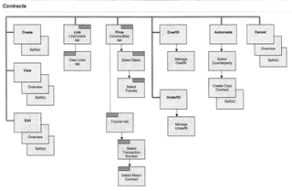
This is a Visual Expression of the different "types" of Contracts.
It helps explain the relationships.
See it in context: User Assistence
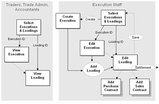
Task Flow
This is a Visual Expression of the interactive process.
It lays out the roles, activity and workflow .
See it in context:Design Specifications
Icons

Airport (1984)
I also design custom icons for use within the interactive environment.
If the UI can be self-explanatory or indicative - without clutter - it's a good thing. People learn it pretty quickly. The classic underline-indication-that-This-Is-Clickable is a good example. In fact, it's so much of a "given" that you don't find the underline as a purely decorative style in most interactive interfaces.
The ability to include a lot of different "sideways" & referential path links in a page is a mixed blessing - esp. since - in a complex info environment - you might be opening up new browser windows or in-page popups.
I like to use icons embedded in CSS styling to indicate "out of the mainWindow" links. For example:
- a globe icon indicates that we're opening an outside-of-this-site WWW page in a new browser window
- a document icon or PDF icon opens a reference document in a new browser window
- a question mark icon opens an FAQ or Help popup
Each of these usually has visible text in the label, as well as a mouseover tooltip explanation that helps prep you for what's coming.
Here are a few examples:
![]() Open a Webpage
Open a Webpage
![]() Edit this
Edit this
![]()
... are visual calls to action
(expecially for clickable elements)
![]() Task Done
Task Done
![]() Rising, Growing
Rising, Growing
![]() Endorsement
Endorsement
![]() Brand Identity
Brand Identity
![]() Document Type
Document Type
![]() Nation/Region
Nation/Region