Health Services Design
HealthyVet / VistA
The computerized personal health record for veterans created by the Department of Veteran Affairs (the VA) was named a national finalist in the "Consumer Empowerment and Protection Awards" given by a national accreditation organization.
The Value Proposition
The Challenge

In early 2013 the VA invited the public to submit design solutions to improve the usability of the standard health information form, which was - admittedly - hard to use.
Entrants will submit a design that:
- Improves the visual layout and style of the information from the medical record
- Makes it easier for a patient to manage his/her health
- Enables a medical professional to digest information more efficiently
- Aids a caregiver such as a family member or friend in his/her duties and responsibilities with respect to the patient
Entrants should be conscious of how the wide variety of personas will affect their design. Our healthcare system takes care of the following types of individuals:
- An underserved inner-city parent with lower health literacy
- A senior citizen that has a hard time reading
- A young adult who is engaged with technology and mobile devices An adult whose first language is not English
- A patient with breast cancer receiving care from multiple providers
- A busy mom managing her kids' health and helping her aging parents
Design Notes


Since 2008 I had been indirectly involved with WorldVistA , an organization which has been advocating the use a common format for a patient Electronic Health Record, based on a system developed by VistA (Veterans Health Information Systems and Technology Architecture).
My design submission:
- Remove obscure and extraneous data, including system "info" that is unhelpful
- Clarify obscure and overly-technical Terminology
- Use color and layout to emphasize & focus on important information
- Medical Data is "table-ized" in a format that is both more concise and easier to comprehend. This also reduces the size of the document.
- Put Content information into "sentence" or "title" case for easier scanning & comprehension (All-Caps is difficult to scan)
- Much of the value-oriented patient assessment info is aggregated into the "Comments" field. It is the most meaningful and accessible info in the doc (for patients, caregivers, and professionals).
- Take advantage of standard word-processor presentation & organization tools
- Identify the patient's "home" facility clearly up-front and consistently throughout.
- Display and Link To relevant online services
- Re-brand the name for ease of comprehension. The label "Healthevet" reads accurately only if you perceive the styling of "health-e-vet" (see logo at top of page)
My design didn't win the competition, but I enjoyed doing the work.
Update
In a related vein: Later I was approached by a colleague who wanted to provide an "open source", self-service platform for information about pharmaceutical products. Here's the mobile-enabled model I created:
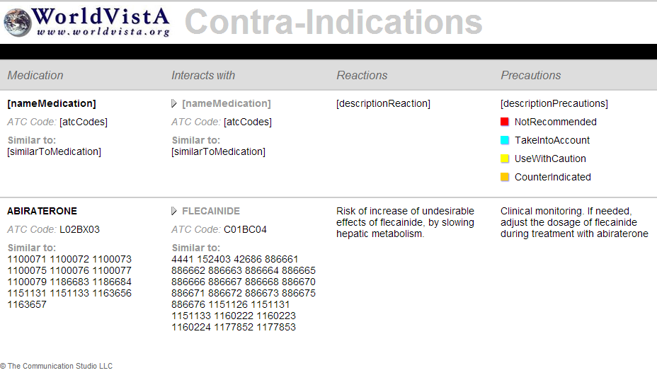
WorldVistA was formed to extend and collaboratively improve the VistA electronic health record and health information system for use outside of its original setting. The system was originally developed by the U.S. Department of Veterans Affairs (VA) for use in its veterans hospitals, outpatient clinics, and nursing homes.
The punchline: VistA was an 'open systems' model for storing and sharing patient Electronic Health Records. It is sort of an "HTML/Web format for health". Desperately needed in the current proprietary, vendor-driven, corporately-dominated environment.
The VistA format is currently the most widely distributed electronic health record used in the US.
In an effort to make the system widely available to institutions outside the Veterans Administration health system, the software code was placed in the Public Domain under the Freedom of Information Act.